
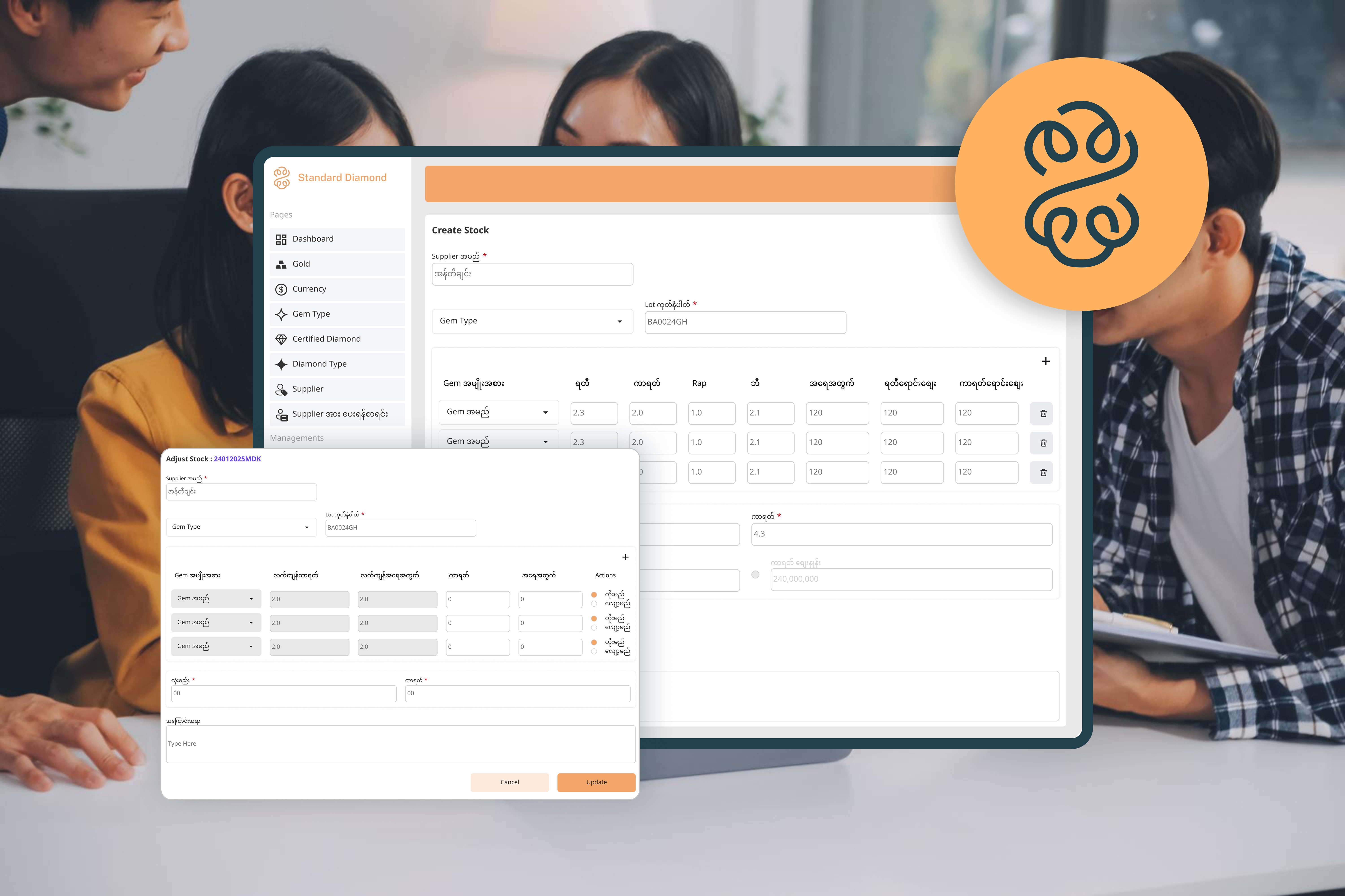
Refining the Flow: UX Insights from a Real-World Jewelry eCommerce Project
Company Objective
To design a simplified, user-centered system for adult users in the jewelry industry by removing unnecessary complexity. The goal was to ensure that all operational data from sales to refunds is systematically organized in one centralized platform, enabling seamless process tracking and smarter decision-making.
Key Results
Successfully created a clear, visual workflow for selling, buying, and refunding processes improving both internal alignment and usability for admins.
Project Type
UX case study on post-launch insights and future improvements
Industry
Jewelry, eCommerce
My Role
Sole UX Researcher & Designer (with guidance from mentor Ma Chaw Su Hlaing)
Duration
From June - July 2025
🚀 UX Opportunity
Company Overview
Meet Standard Diamond: Simplifying Jewelry Operations from the Inside Out
Standard Diamond (SD) is a prominent diamond wholesaler based in Myanmar’s jewelry sector. Traditionally reliant on physical booklet-based data tracking, the business began transitioning to a digital storefront to serve both wholesale and individual customers more efficiently.
Business shift was driven by the need to reduce risk, streamline operations, and support multi-currency transactions for a diverse customer base


UX Gaps Identified @ Standard Diamond


Part 1
Business Flow Misunderstanding
Due to the large data set and complicated workflow, users faced how to make few processes within a short time.
Need a mentor/senior for new joiners to help tasks complete.
Since the project is moved from physical booklet to virtual booklet, not only current employees faced unfamiliar keywords and workflows but also new joiners might face in the future.
Discover
From Confusion to Clarity: Rethinking the Business Flow Experience
Solution 1: Use Tooltips or Labels
Challenges:
(1) Users might complete the task during onboarding, but will likely get confused later when context changes.
(2) Devs may implement help labels per screen/component and it will take times since the project has lots of flow.

“As a user, I don’t get what I’m supposed to do first… and this tooltip just tells me to click a button. But why?”
Solution 2: Self Learning System
Challenges:
(1) Passive learning (just watching) might not stick as well as active learning for users
(2) If business rules change (e.g., refund policy updates), the learning system needs to be updated too which takes time and coordination for devs.

✨ UX Takeaway
After evaluating both solutions from the user’s and developer’s perspective, I chose to move forward with Solution 2.
It’s a strategic solution that supports clarity, confidence, and long-term autonomy in navigating complex business flows.
Define
Why SD Learning is the Right UX Fit for Deep Complex Systems
Although users initially followed our virtual hand-off, confusion emerged once real-world tasks began. The mental models they formed during onboarding weren’t deep enough to support autonomy.
That’s why I proposed SD Learning not just to deliver tutorials, but to rebuild their mental model in a way that matched our platform's complexity.
🔻 Before
Mismatch in Mental Models
-
User Assumption: “This works like a simple sales system.”
-
Reality: Complex flows → multiple currencies, refunds, inventory types
-
Result: Questions, errors, hesitation
🔄 UX Intervention
How SD Learning Supports Mental Models
-
Learning "how to learn"
-
Step-by-step tutorials
-
Visual recognition > memorization
-
Low-risk trial + feedback
💡After
Mental Model Realignment
-
Increased confidence
-
Reduced questions
-
Less dependence on seniors
-
Smoother decision-making
Figuring out the right flow for all user types to use SD Learning


UX Outcomes for Administrators
I designed the SD Learning Dashboard to help owners and administrators monitor and manage learning content efficiently. The dashboard provides a clear overview of:
Total number of tutorials
Created by / Updated by
View counts for each tutorial


1. Video Tutorials
Admins can easily create a new tutorial by uploading:
Thumbnail image
Tutorial title (heading)
Video file
Supporting description
2. Documentation Tutorials
For step-by-step guides, admins can upload:
Thumbnail image
Tutorial title (heading)
Descriptions with the option to include step visuals or screenshots
This setup ensures that both video-based and text-based learning resources are quick to create, structured, and easy to maintain.

UX Outcomes for Users

1. SD Learning page
Users can access tutorials and instructions in both video and documentation formats, depending on what administrators upload.
Each resource is designed to support task clarity and self-guided learning.
In addition, a search box within SD Learning allows users to quickly find tutorials by keyword or topic reducing time spent navigating.
2.Learning Detail Page
Users can watch or read each tutorial, then mark it as done to keep track of what they’ve already completed helping them stay organized throughout their learning journey.

Future Impact Hypothesis
Based on similar systems and established UX patterns, I hypothesize that implementing the SD Learning page would reduce onboarding time by approximately 50%, decrease task errors, and lessen support dependency for new users.
While this estimate is not yet validated through user testing, it is grounded in user-centered design principles and industry practices where just-in-time learning and embedded documentation have consistently improved adoption and user confidence.
Part 2
Time on finding a specific category
Deep menu structures increased task time and navigation friction.
Users struggled to locate specific tools or subcategories quickly.
In the SD product, users interact with a complex structure consisting of 8 core categories, 8 core management modules, and a total of 27 subcategories. During my user flow analysis and information architecture review, it became clear that traditional navigation alone would not support quick, intuitive access across such a deeply nested system.
Discover
Reducing Search Time in a Multi-Module Platform
Since we implemented a deep-hierarchy-and-branching-workflows platform, users took a specific time on finding their destination.
To address this, I proposed the implementation of a global search function , a solution focused on improving findability, reducing cognitive load, and supporting efficiency for both novice and advanced users.
Define
Why Global Search is the Right UX Fit for Deep Hierarchical Systems
Although the platform was successfully launched, users struggled to navigate efficiently due to its deep hierarchy and branching workflows.
That’s why I proposed the Global Search feature: not just a shortcut, but a UX strategy designed to match how users expect to find information in complex system
🔻 Before
Mismatch in Mental Models
User Assumption: “I’ll just click through menus until I find it.”
Reality: Nested modules, unfamiliar naming, complex branching
Result: Frustration, time wasted, reliance on seniors
🔄 UX Intervention
How Global Search Supports Mental Models
Reduces Cognitive Load → no need to remember exact path
Supports Fast Recall → users type keywords & locate modules instantly
Fits User Expectation → like Google, not a maze
Efficiency → saves time for both new and advanced users
💡After
Mental Model Re-alignment
Tasks are completed faster
Users feel more in control
Reduces unnecessary clicks and help requests
Platform feels “smarter” and more user-aware
UX Outcomes
Reduced navigation time across core tasks
Increased confidence for new users in unfamiliar system layouts
Created foundation for future smart search features (e.g., recent searches, category filters)

Future Impact Hypothesis
Based on usability benchmarks from platforms like Shopify Admin and QuickBooks, global search implementation is expected to:
Reduce item search time by 70–80%
Improve task efficiency across refund, sales, and inventory workflows
Minimize reliance on menu structure memorization
Boost confidence and reduce frustration, especially among new joiners
Benchmarking & Validation
• QuickBooks' search-driven features reduced user workload by approximately 29 hours/month link
• An enterprise CRM study found that natural-language search saved users more than 50% in time vs menu navigation link
These benchmarks reinforce the UX hypothesis that implementing a global search system in this jewelry eCommerce admin platform could reduce item-search time by 70–80%, minimize user errors, and boost confidence during complex workflows.
MVP Mindset
Working on this jewelry eCommerce admin dashboard taught me how to approach UX with a MVP mindset, especially in a project that already had a deep structure and a fixed UI template. Instead of focusing on visual redesigns, I focused on enhancing usability, reducing friction, and supporting real user needs through practical UX decisions like global search and a learning support system.
Clear workflows matter more than complex UI
I learned that clear workflows matter more than complex UI, especially for new team members navigating high-stakes tasks like refunds and inventory management. Even without access to direct user interviews, I was able to build empathy through persona-based thinking and audit the system using usability heuristics.
Choosing the Right UX Strategy
This project reminded me that UX isn’t about using every method but it’s about choosing the one that fits the context.
For example, card sorting didn’t make sense here due to the fixed information architecture and time constraints.
Instead, I leaned into mental model mapping because it helped me explain why users struggled and how to guide them better through self-learning tools.