

01
Project Overview
1.1
Our Goals
To Build good habits and break bad habits
To Track progress without overwhelming
To Stay motivated with mild reminders
To create Simple, minimalistic and intuitive design
1.2
Problem Statement
Most users lose interest over time because of overcomplicated, annoying notification, complex and user interface.
1.3
Possible Solutions
By creating simple and users need oriented designs and only allowing to customize notifications to reduce unnecessary notifications.
1.4
Timeline

02
Understanding the users
2.1
Problem Statements
The users struggle to maintain consistent habits due to complex, non-engaging tracking tools.
They need a simple, user-friendly app with gentle reminders, progress tracking, and social features to stay motivated and build habits effectively.
2.2
Solutions
Develop a simple, user-friendly habit-tracking responsive app with
gentle reminders,
visual progress tracking and
intuitive user-interface design.
This should be non-overwhelming, easy to use and engaging to help users like the users from user-interview build and maintain consistent habits while staying motivated
2.3
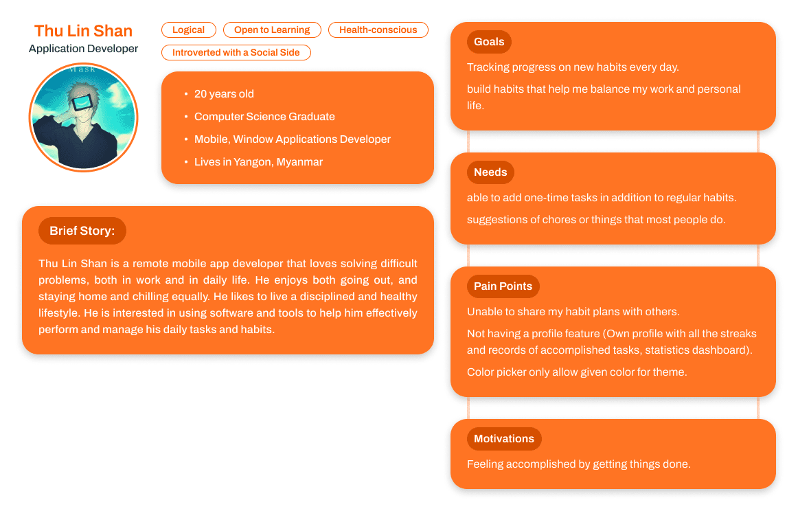
User Persona


2.4
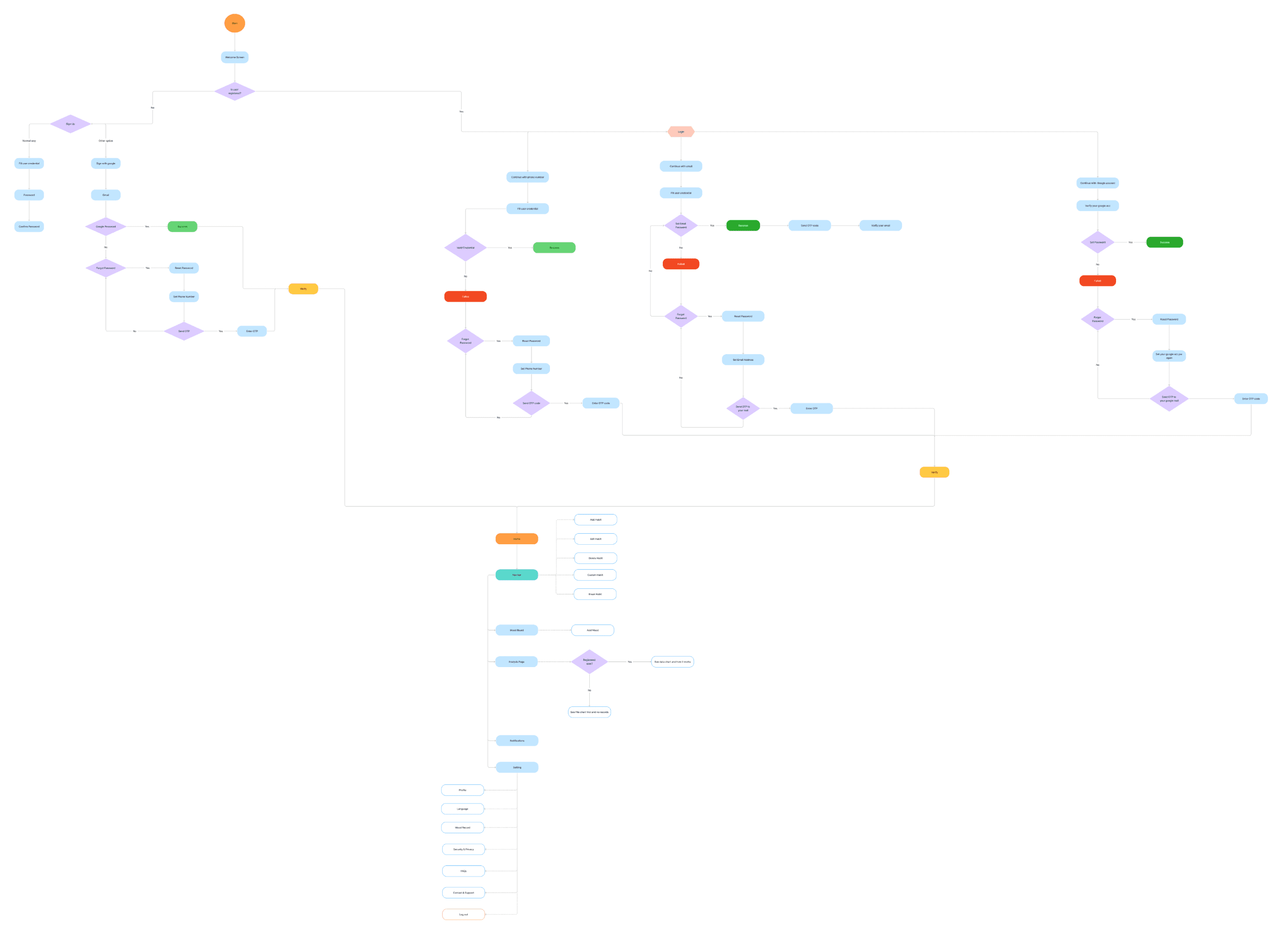
Information Architecture

03
Design Process
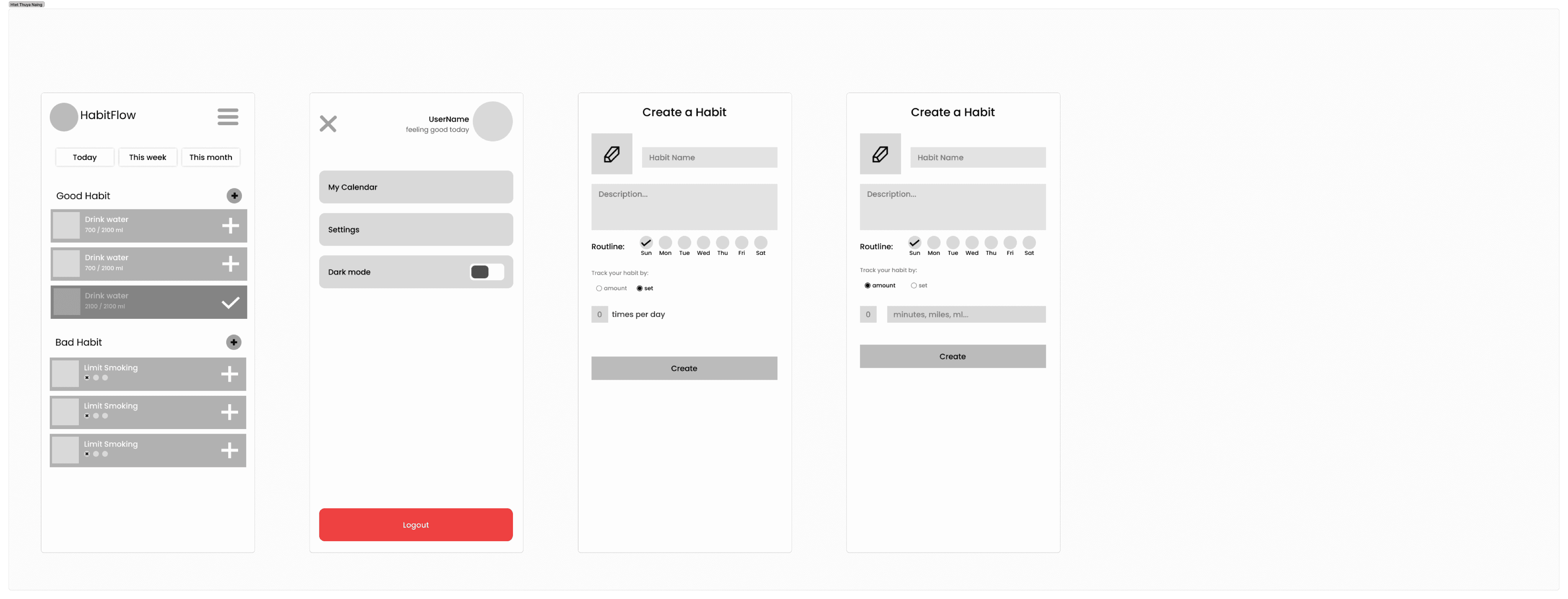
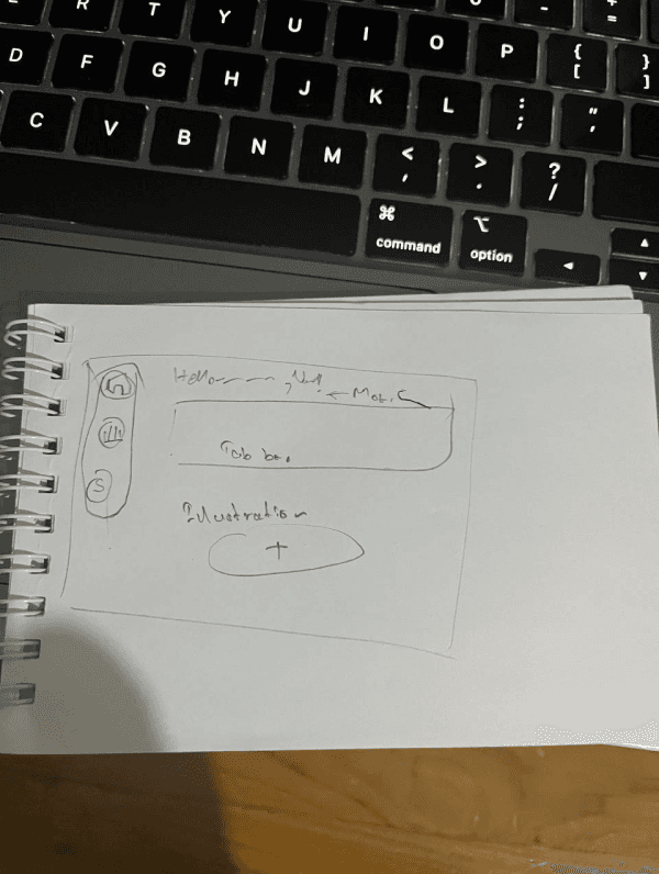
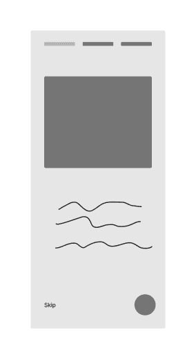
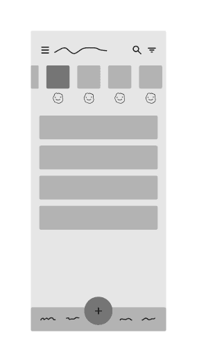
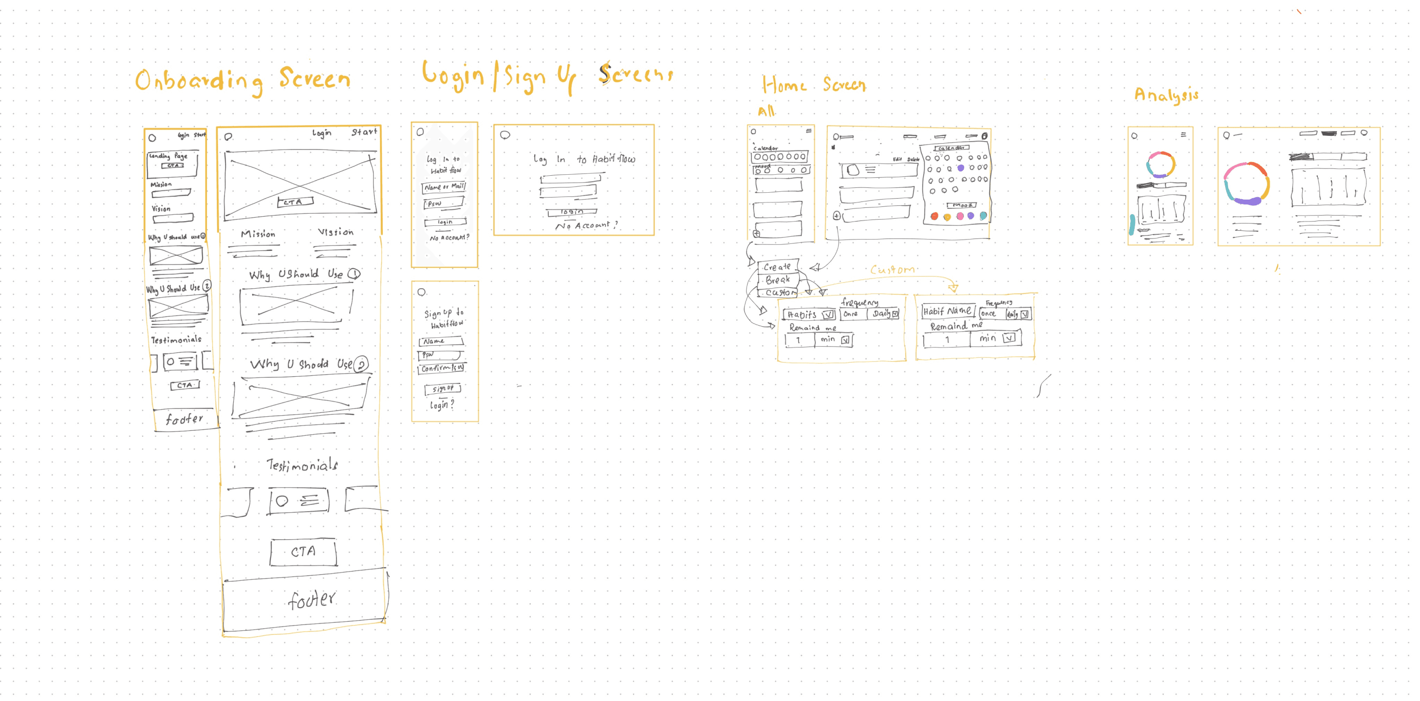
We decided to create the whole website design by each designer to know everyone’s ideas and process. After that, we discussed and collected the parts that made our Habit Flow more minimalistic and effective.








3.1
Summary
It was fun and we got to know everyone’s approach to deliver the user-friendly designs.
After that, we fixed the part we would like to make it real and collaborate with everyone’s useful and best parts.
Then we separate the parts who needed to do and at the same time we started making style guide.
3.2
Logo Branding


3.3
Style Guide
3.3.1
Colors


3.3.2
Typography
Fonts
Font: 1
Microsoft Sans Serif
AaBbCc
Juxtaposing sleek typography with vibrant hues, the quirky zebra dances amidst carefully crafted patterns.
0123456789
Headings/H-1

Headings/H-2

Headings/H-3

Headings/H-4

Body/B-1

Body/B-2

Body/B-3

Body/B-4

3.3.3
Icons
Here are the most used icons in Habit Flow Responsive Website. We use icons from @shadcn/ui for our development’s ease of use.
3.3.4
Spacing

3.4
High Fidelity
After finishing up on the main ideas from our low-fidelity designs, we improved the visuals, and interactions to make the design more polished and easy to use. We kept everything simple and clear to make Habit Flow look clean and engaging.
3.4.1
Mobile Responsive

3.4.2
Web Responsive


04
Future versions
Currently, we only support light mode and english language for every user. But we hope in the near future we can support dark mode and multiple language as well for more accessibility.
4.1
Supporting Dark Mode

4.2
Multiple Language Support